Overview
Oasis is an online Student Advising site for UC Davis to submit major change requests, look at their transcripts, monitor their academic performance, and more. However, the numerous tools that the platform has available makes using it to its full extent difficult. I wanted to see how I could improve students’ experience of using OASIS as an advising tool to help them finish their degree.
Role
UI/UX Design, UX Research
Duration
1 week, Sept 2022
Tools
Figma, FigJam
UNDERSTANDING
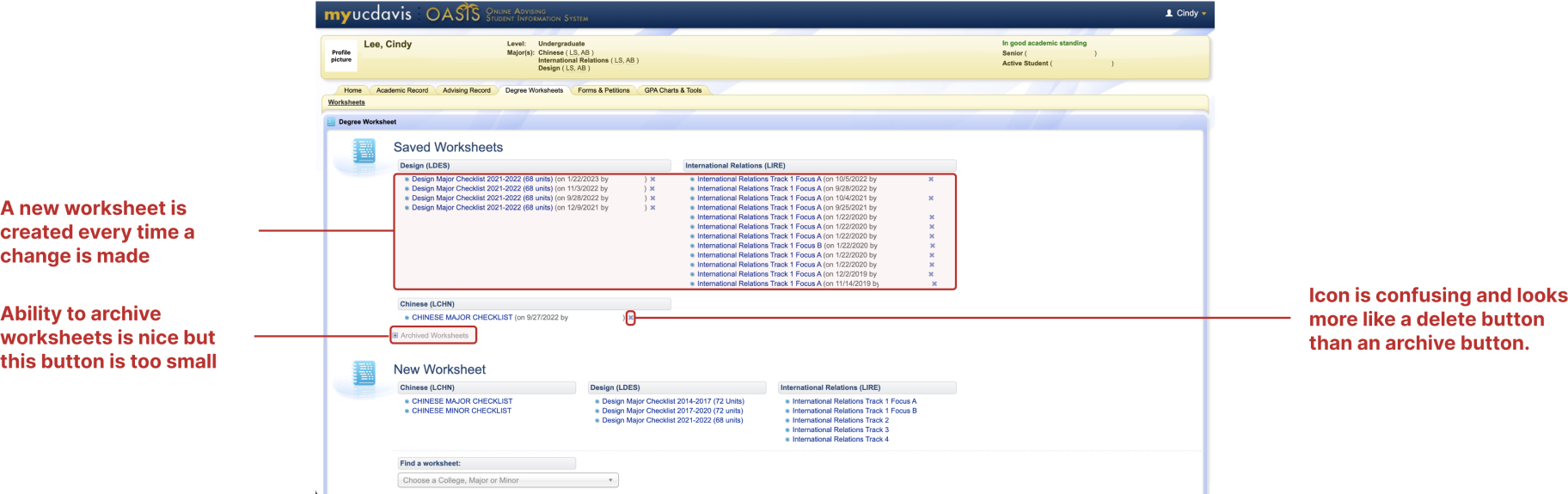
Analyzing Current Design
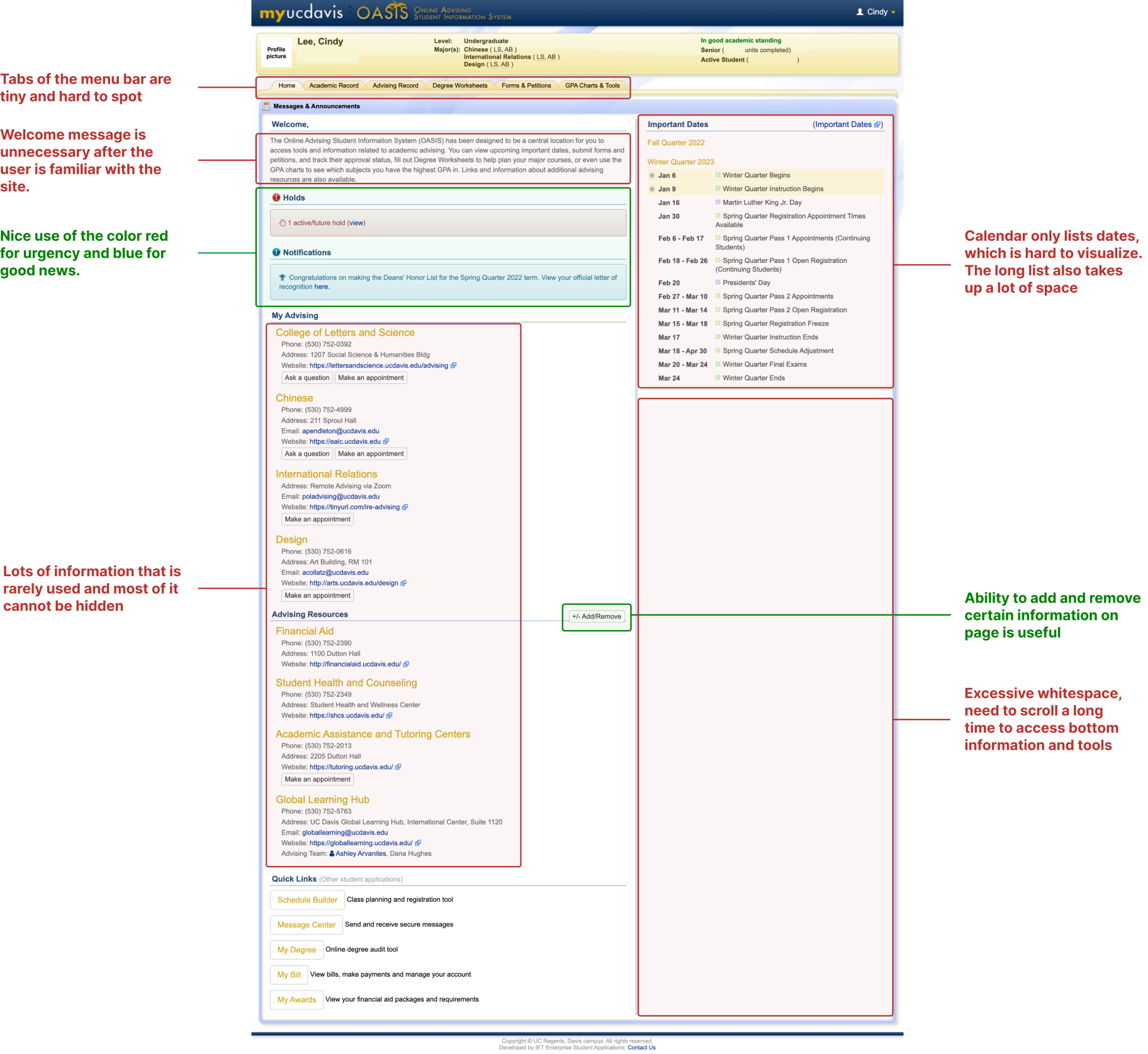
As a student at UC Davis, I was familiar with Oasis; however, I still wanted to do a deep analysis of the website to ensure that I had a deep understanding of the product I was redesigning before I began. Here are some of my observations.
USER RESEARCH
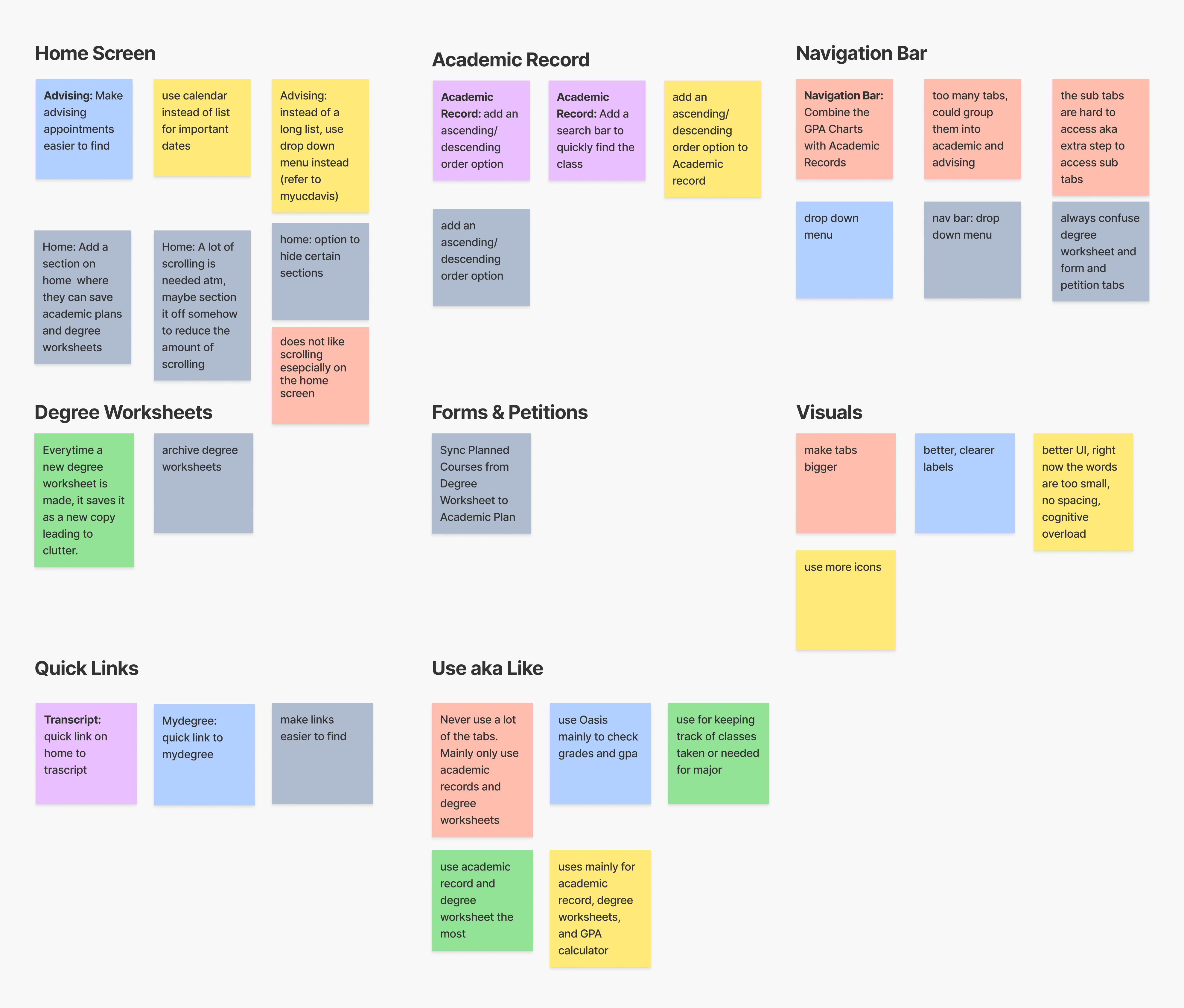
Hearing From Students
To learn more about the users, I interviewed 6 UC Davis students and had them share their experience using Oasis. After gathering their responses, I categorized their feedback using an affinity map.
IDEATION & SYNTHESIS
Pain Points and Solutions
From my affinity map and design flaws I observed in my review of the current design, I compiled a list of common user pain points and began ideating solutions for each pain point.
01
01
Only Use A Few Features
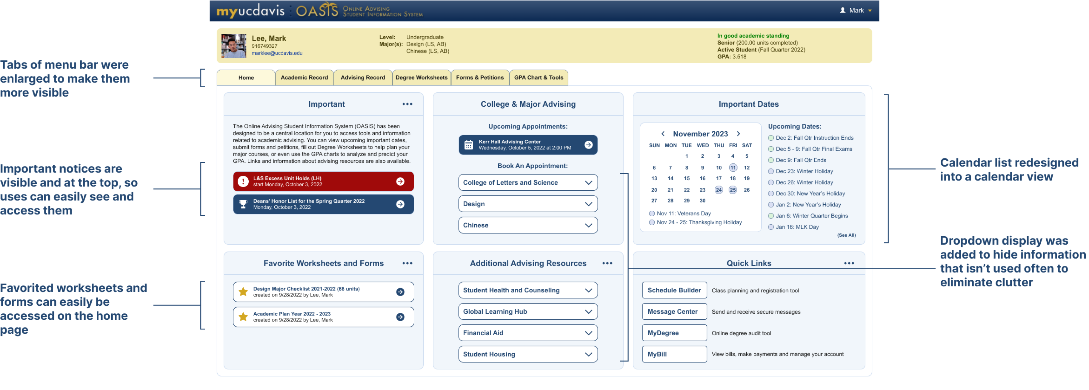
5/6 users reported that they only use Oasis for a few key features such as "Academic Records" and "Degree Worksheets" and rarely utilize any of the other features. However, these features are mixed in with the sea of other features making them inconvenient to access.
Solution: Redesign Most Used Features and Added Home Edit Feature
Since time was limited, I chose to focus only on redesigning commonly used pages such as the "Home" page, “Academic Records”, and “Degree Worksheets”. On the Home Page, an edit option will be added to give users the ability to edit what they want to display in each section for a more personal, customizable experience and to further eliminate clutter.
02
02
Home Screen's Excessive Whitespace
6/6 users shared that they disliked having to scroll so far down on the home screen to access certain features, which makes it time-consuming and hard to find important tools. In addition, they do not understand why there is so much whitespace on the home page.
Solution: Minimize Sections and Eliminate Whitespace
I will use different components to better display information and the goal is to eliminate the need for scrolling. For example, dropdown displays will be used to hide information that the user won’t access often. Unnecessary whitespace will also eliminated. A calendar view will be used instead of a list view to improve the viewing experience for the user.
03
03
Sorting Options for Academic Records
4/6 users expressed that they wanted more sorting options for academic records, especially the ability to sort in descending order to avoid scrolling.
Solution: Added More Sorting Options For Academic Record
I will add the option to sort in descending order to avoid scrolling to find most recent courses, as well as, the option to pick certain courses (i.e. all courses, UCD courses, non-UCD courses).
04
04
Ability To Save Favorite Links
4/6 users often use Oasis to access a couple of their most frequented links and expressed wanting an option to quickly access these links. They also wanted quick links to other important websites and resources that were relevant to their academics such as MyDegree and access to their transcript.
Solution: Favorite Links Section
A section will be added on the Home page for users to quickly access their favorite worksheets and forms to further streamline the task flow. I will also add more quick links to other resources and websites that may be useful for a students’ academic success.
LO-FI WIREFRAMES
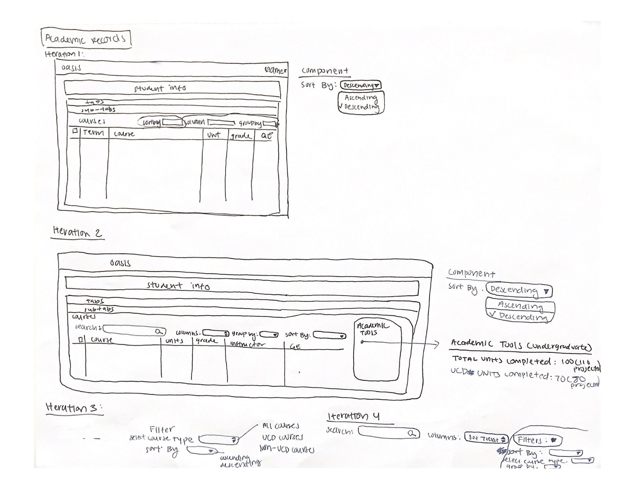
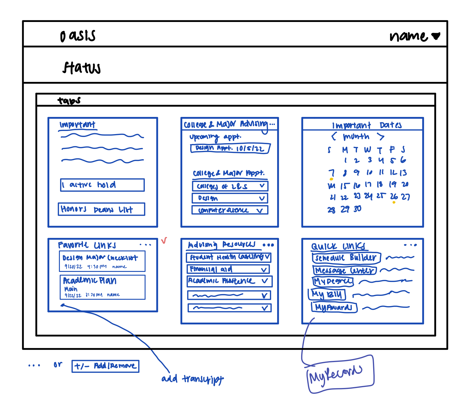
Visualizing My Ideas On Pen and Paper
I began to visualize my solutions by sketching out some low-fidelity wireframes. My primary focus was on the Home page, as users had the most difficulty using it.
HI-FI PROTOTYPE
Transitioning to Hi-Fi
For this project, I wanted to focus on improving the user experience of the website and avoid doing a complete UI makeover in order to stay consistent with other UC Davis websites and lower the learning curve for students, so I mainly used the current Oasis design system and design patterns or components of other UC Davis website.
USABILITY TESTING
Putting It To The Test
I conducted three usability tests with UC Davis students who all had prior experience using Oasis. The primary objectives of these tests were to gather initial impressions, compare the existing and my proposed designs, assess the intuitiveness of my icons, and observe the ease of navigating through my prototype. To test the intuitiveness of my prototype, I assigned them tasks and had them verbalize their thought process as they navigated through my prototype. They were also asked to rate them based on difficulty from a scale of 1 to 5 (1 being the easiest to 5 being the most difficult). I also turned off Figma hotspots to limit the amount of support they had while navigating through my prototype.
Usability Testing Results
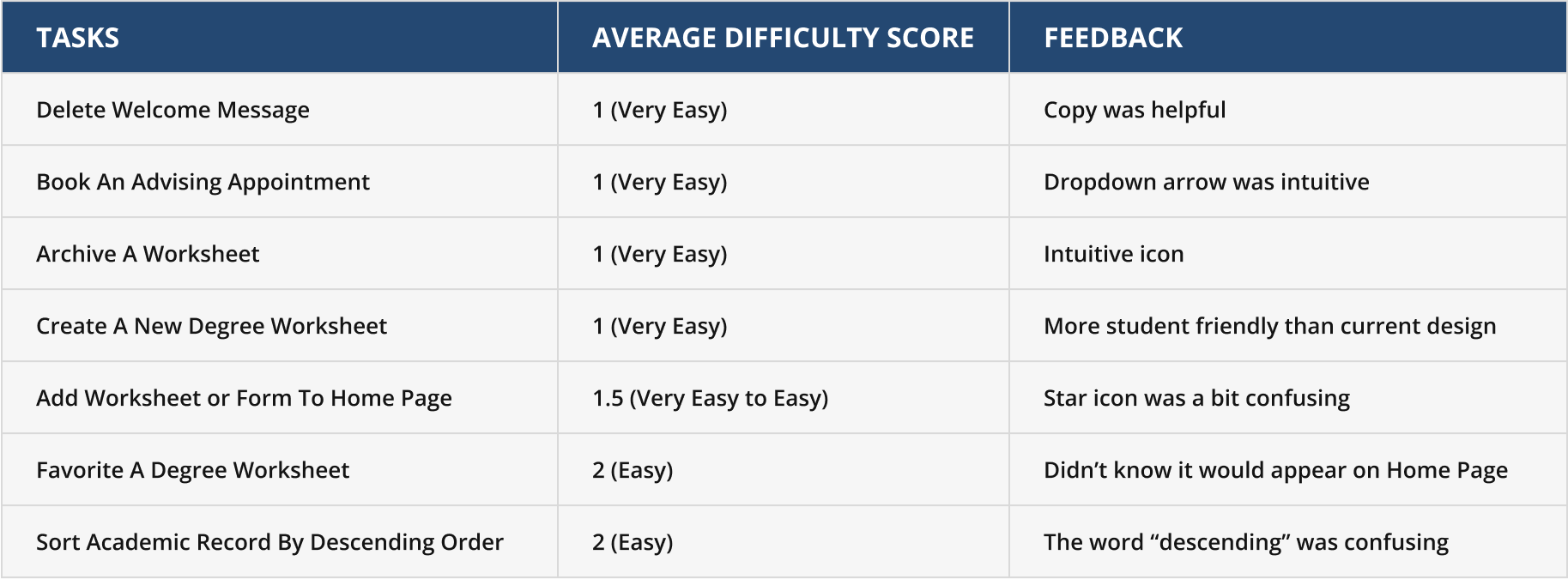
In general, users had very little difficulty navigating through my prototype and all users liked my redesign more than the current design. However, there were some areas for improvements.
Likes:
- Highlights the important information and hides the unnecessary or less used information
- Customizable experience
- Intuitive icons
- Lots of copy to aid users’ understanding
- Simple, clean, and organized design
- Brought to their attention key features that weren’t obvious in the current design
Wants:
- Some of the copy could be improved
- Favoriting a worksheet is a bit confusing as the relationship between favoriting a worksheet or form in Degree Worksheets to appear on the Home Page is not obvious
- Change to Academic Records is not obvious and would like more ways of displaying and sorting the information
- Does not want a new Degree Worksheet to be created after each update
USABILITY TESTING
Refining Features
Gathering all of the findings from our tests, we made the following changes:
01 Improved Favoriting A Worksheet Flow
Taking inspiration from Gmail, I added a pop up at the bottom of the page as positive reinforcement to let users know that they have successfully favorited a worksheet and this worksheet will now be added to their Favorites section on the Home Page to emphasize the connection between the pages and their action.
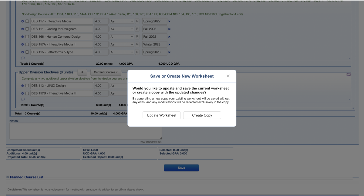
02 Streamlined Degree Worksheet Flow
A pop up asking the user to either update or create a new worksheet with their new changes was added to eliminate duplicate worksheets but also keep the option to create a new worksheet in case they want to save different versions of their worksheets to reference in the future.
HI-FI PROTOTYPE
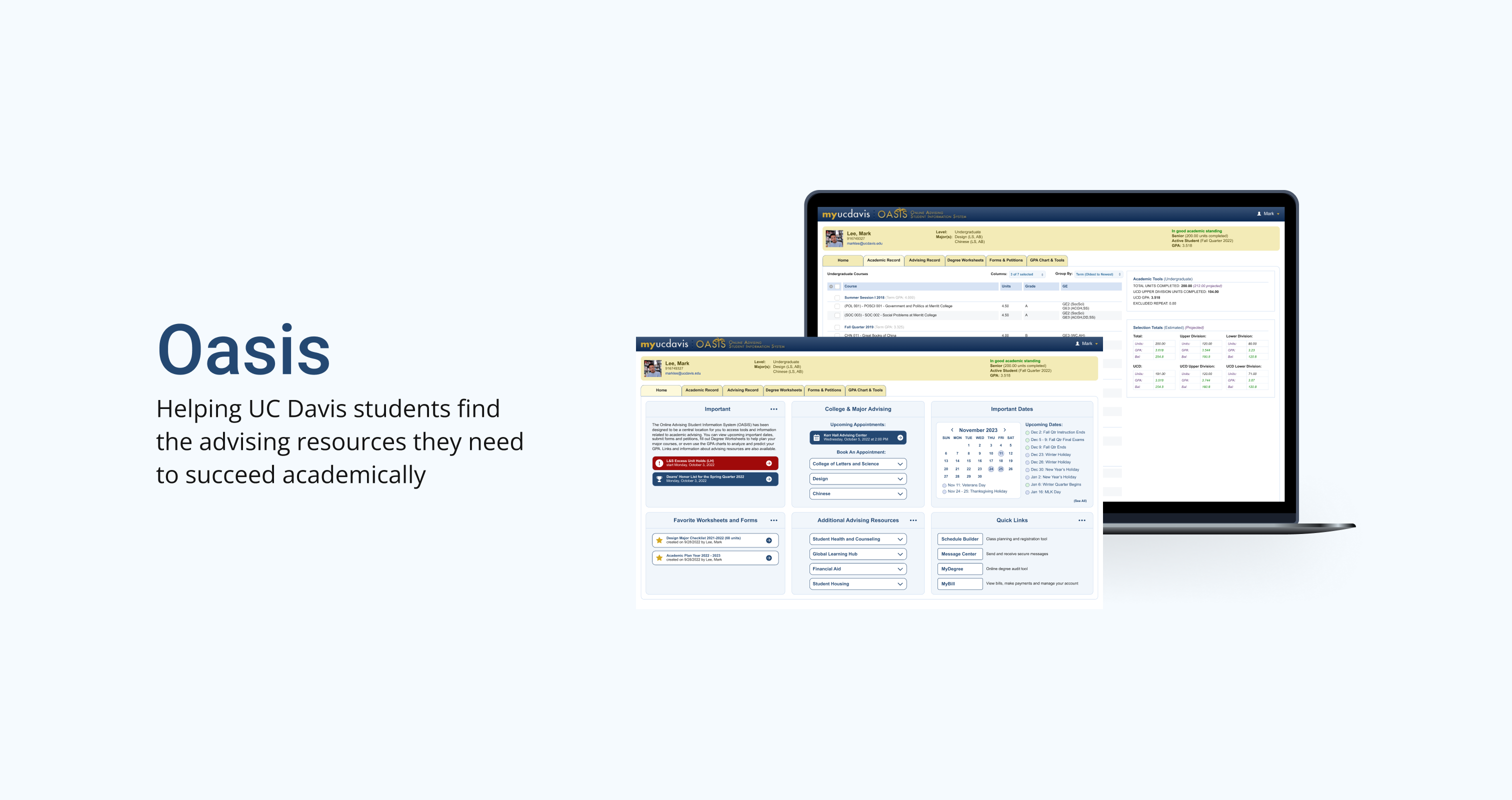
Helping UC Davis students find the resources they need to succeed academically
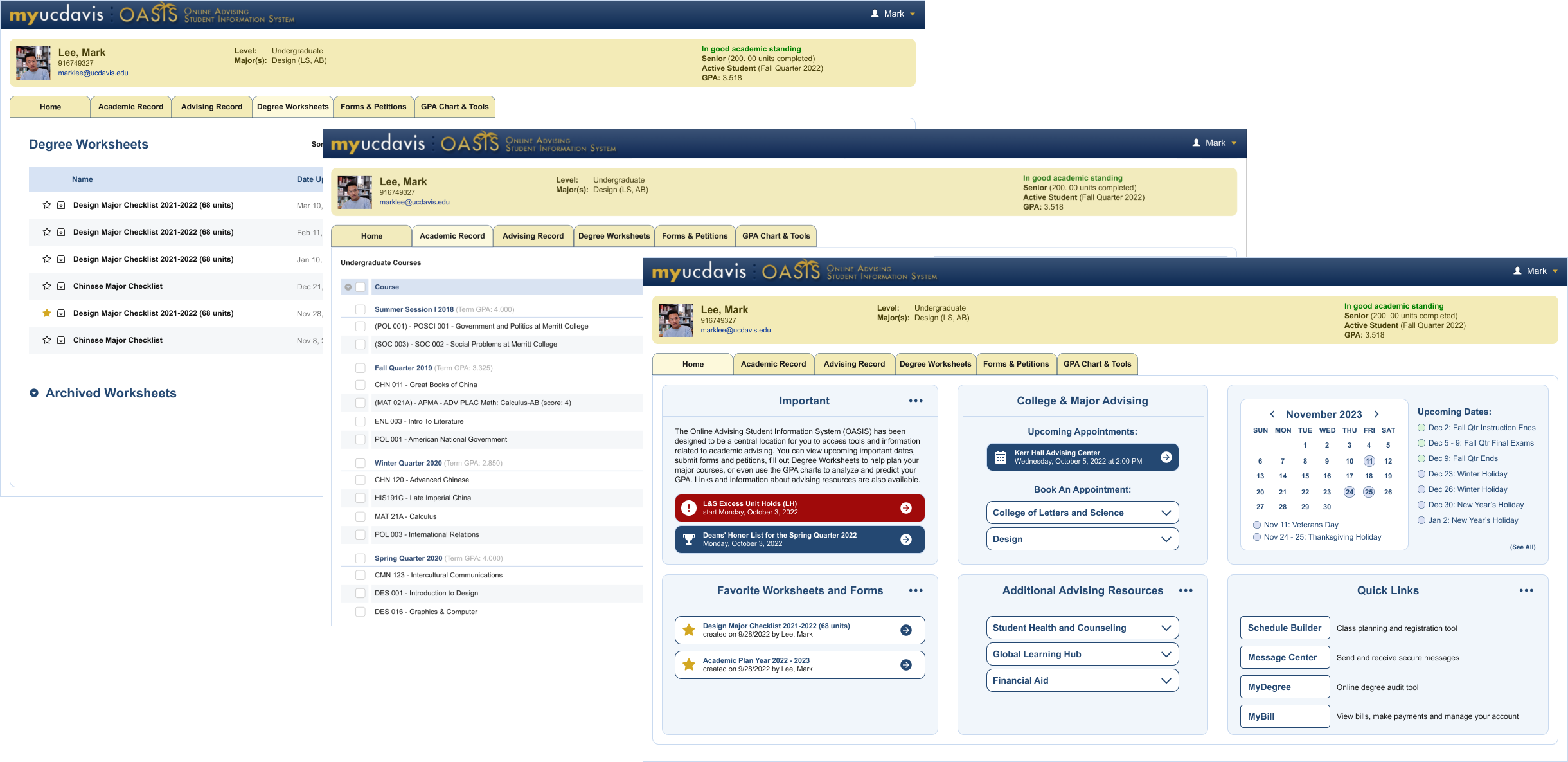
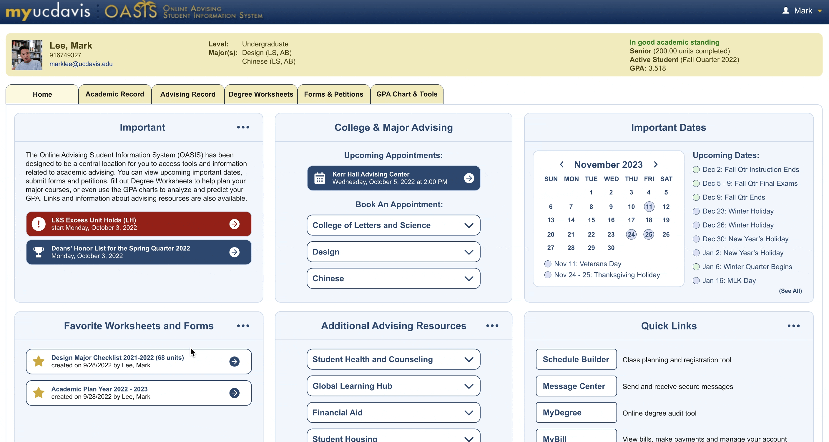
Home Page
The Home screen was redesigned to eliminate unnecessary whitespace and the need for scrolling so users can see everything they need at a glance. The tile format was inspired by another UC Davis website, myUCDavis, which uses tiles to organize information.
Personalize Home Screen
To give users more control on what to display on their Home screen, users can click the more icon to add or remove certain information.
More Filters For Academic Record
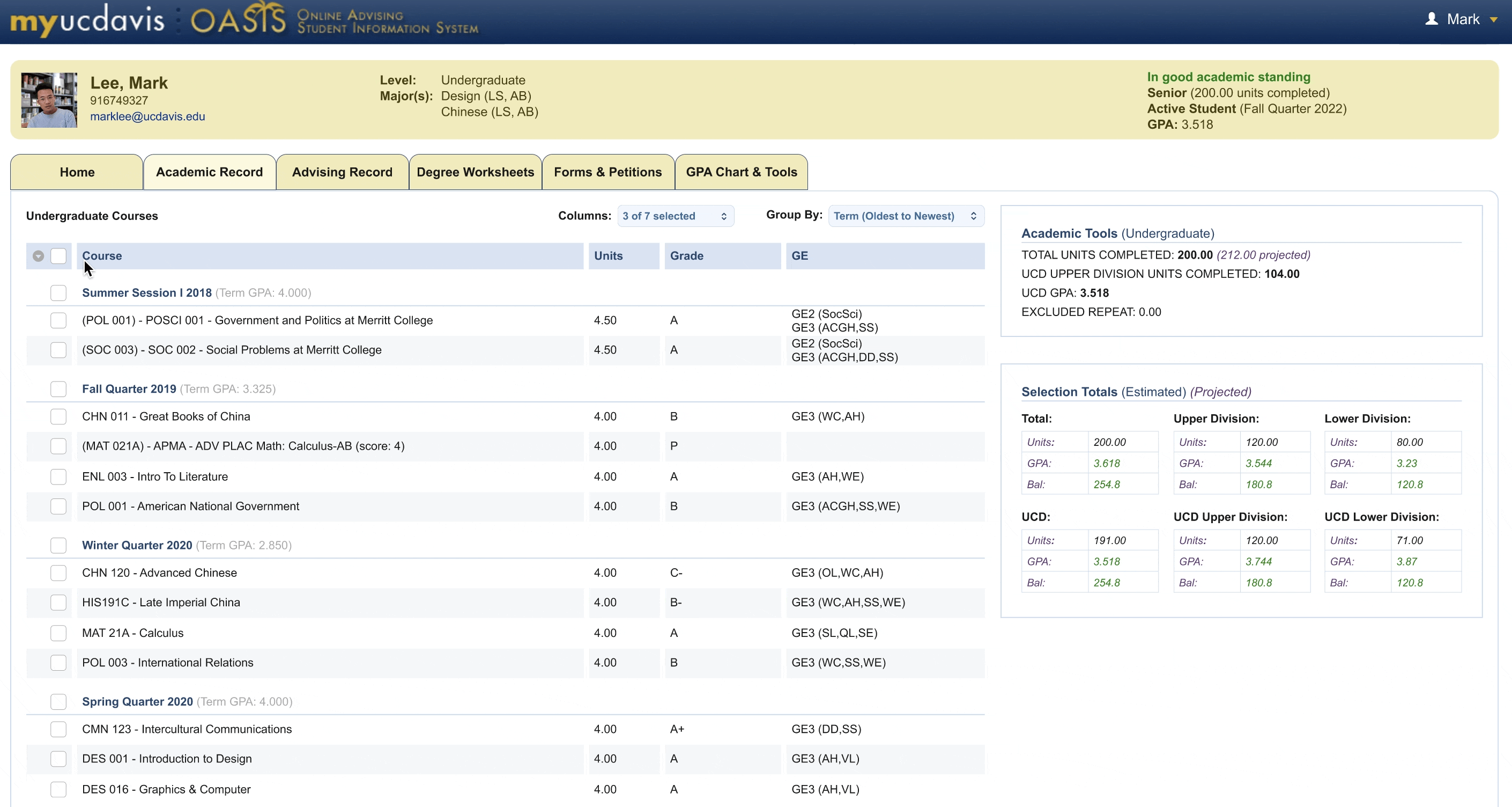
One of the most requested features was the ability to sort all courses in descending order to eliminate the need to scroll all the way to the bottom of the page to look at their latest courses, so that sorting feature was added as an option. The copy was updated from “descending” to “oldest to newest” and vice versa for “ascending” to aid comprehension. Another option to sort by UC Davis courses and non-UC Davis courses was also added for students who want to check if their high school, community college, or past college classes have been successfully added.
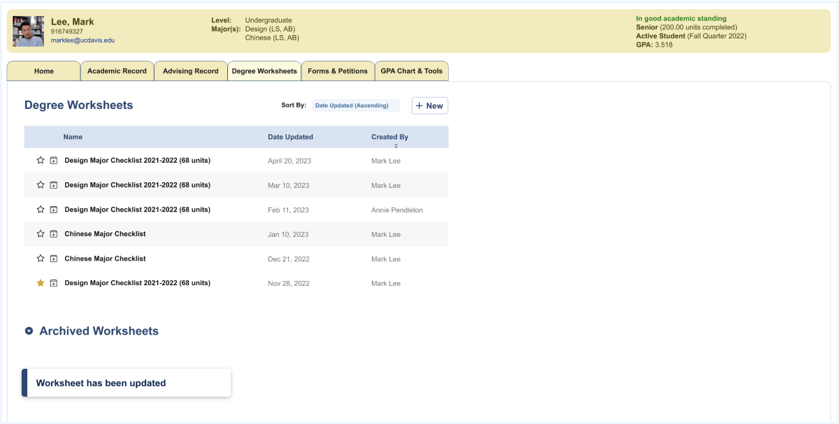
Streamlined Degree Worksheets Page
The current Oasis design saves a new copy of a degree worksheet each time the user edits a worksheet which results in clutter and a poor user experience. Due to the obscure nature of the archive button and the unintuitive icon choice, majority of users were not aware that they could archive worksheets. Even those who knew about it seldom utilized this feature due to concerns that it might delete the worksheet, primarily because of the poor design decision to use an "x" symbol for archiving. My design uses whitespace to make the information easier to read, skim, and digest. By changing the archiving symbol, I also enhanced the visibility of a previously inconspicuous feature, thereby encouraging users to make better use of it.
CONCLUSION
Takeaways
I had a lot of fun improving the design of a website that I use often but struggle to fully utilize due to its poor UI and UX. I especially enjoyed the interview process where I got to understand on a deeper level how my peers experience Oasis. Our different opinions and pain points goes to show how everyone has different opinions and shows how important user research is to finding different pain points and designing experiences that reflect these differences.
CONCLUSION
Next Steps
Given more time, I would like to do the following:
- I would like to redesign other features of Oasis based on the user feedback I gathered, especially the “GPA Chart & Tools” since my interviewees and testers mentioned that it was a feature they used.
- I would also like to find a way to consolidate some of the features since users have expressed that a lot of the features feel repetitive and divided. Specifically, I would like to find a way to consolidate Academic Record with GPA Charts & Tools since they both have GPA testing options.
- Conduct some A/B testing to test different layouts