Overview
AggieExchange is an online marketplace platform designed specifically for UC Davis students. The goal is to create a platform that connects students, allowing them to buy and sell products and services within their community. I was one of two product designers in charge of the product from its inception to its beta launch.
Role
Product Designer
Team
Product Designers (2), Developers (4), Product Managers (2), Technical Product Manager (1)
Duration
6 months
Jan 2023 - June 2023
Tools
Figma, Adobe Illustrator, Google Forms, Notion
UNDERSTANDING
The Predecessor: AggieCentral
AggieWorks is a student run organization comprised of product managers, designers, and developers, who work in cross-functional teams to create real-world products to solve problems for UC Davis students. AggieExchange is one of three products within this organization. However, before AggieExchange, we were called AggieCentral, a map app for UC Davis students to highlight various study, food, and resources on campus. We started by extensively researching UC Davis students' wayfinding needs but found that most students were able to quickly find resources on campus and there was no need for this product. As user-centric designers, we advocated for a different product prompt, a process that required defending our decision with our research data against multiple stakeholders. We eventually gained the freedom to choose a new prompt.
To find inspiration for our new project, we surveyed UC Davis students about potential product ideas. The top two requested products, club discovery and roommate finding, were already being pursued by other AggieWorks teams. Feeling stuck, I turned to Facebook groups for UC Davis students, where I noticed numerous textbook and iClicker listings. Recalling my own failed experiences of buying and selling textbooks, I shared my idea with my team. Recognizing the need for a dedicated marketplace platform, we conducted market analysis, identifying areas for enhancement within the marketplace platforms catering to UC Davis students.
USER RESEARCH: SURVEYS
Listening to Students- 69 Survey Responses
To better understand how students are currently purchasing and selling items, we sent out a Google Form to UC Davis students asking quantitative questions regarding their experience using or not using marketplace apps. Our survey garnered 69 responses from UC Davis students, and we learned that students are having difficulty finding items using existing marketplace platforms.
43%
of students use a Davis-centered marketplace platform
54%
of students take weeks to find an item they want to purchase
68%
of students have trouble selling items on marketplace platforms
Main reasons for using a marketplace platform:
- Affordability
- Sustainability
- Variety of products, especially access to uncommon items
Main reasons for not using a marketplace platform:
- Unfamiliar with platforms
- Don’t need anything
- Condition / Don’t want to interact with others
USER RESEARCH: INTERVIEWS & FOCUS GROUPS
Diving Deeper- 14 Interviews & 1 Focus Group
To gain a deeper understanding of students’ experiences with marketplace apps, we conducted 14 interviews with a range of UC Davis students and a focus group with 6 participants. We discovered four common themes across our interviews and focus group:

01
Prefer Pick Up
Majority of respondents prefer to pick up an item because they want to check the item’s condition before making the final decision. They also don’t want to pay for shipping fees.

02
Concerned About Safety
Safety has been a pain point brought up by several participants, who are concerned about the trustworthiness of sellers and afraid of scammers and false advertising about the quality.

03
Cannot Find Items
Finding items they need can be tricky, especially with the lack of filters and large number of new listings on some platforms. This result in students taking week(s) to find items they want.

04
Poor UI
Existing marketplace platforms have cluttered interfaces and on Facebook, the current most popular solution, they often have to join multiple group pages in order to sell or find an item.
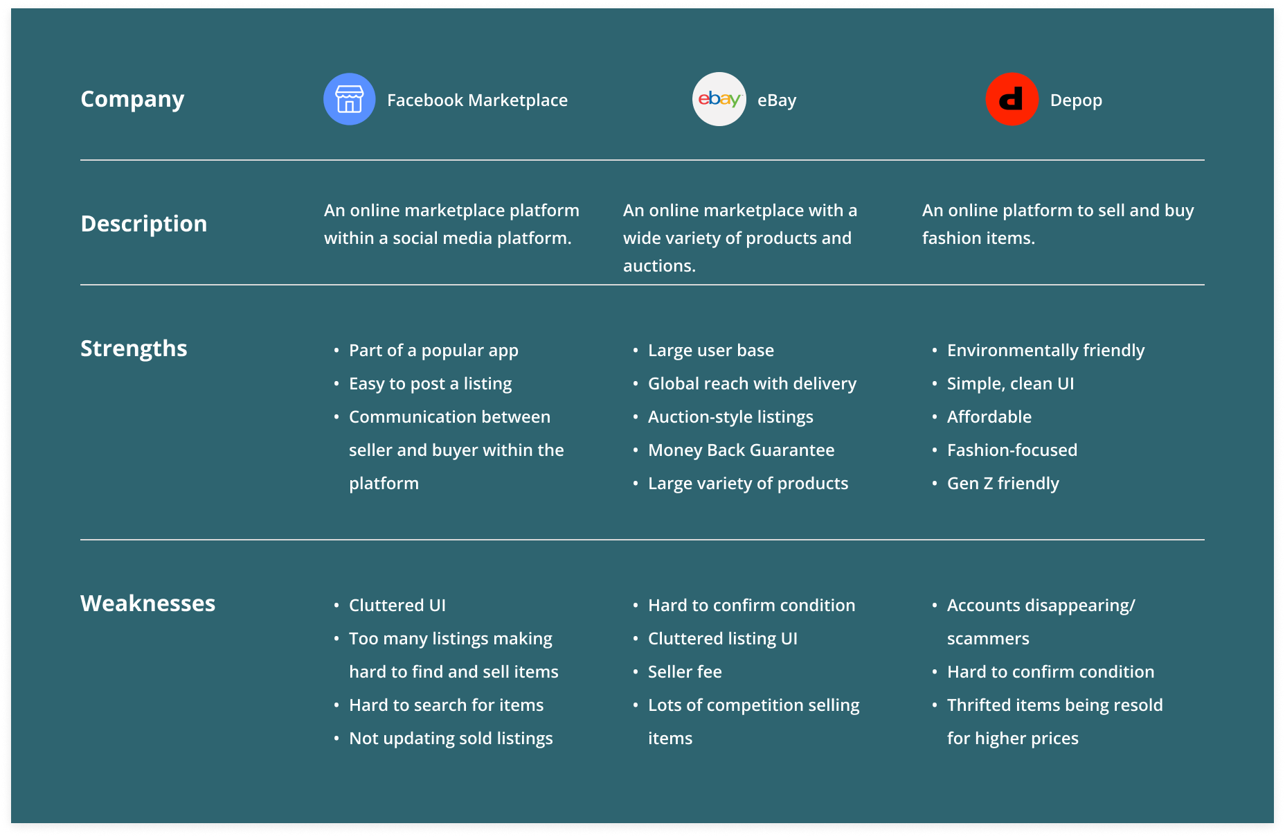
USER RESEARCH: COMPETITIVE ANALYSES
Understanding the Competition
We wanted to explore what was currently successful in other marketplace apps and identify areas for improvement, so our Product Managers conducted a competitive analysis on 7 popular marketplace apps and websites with our students based on their survey responses. Here are the top three most popular marketplace platforms with our survey respondents.
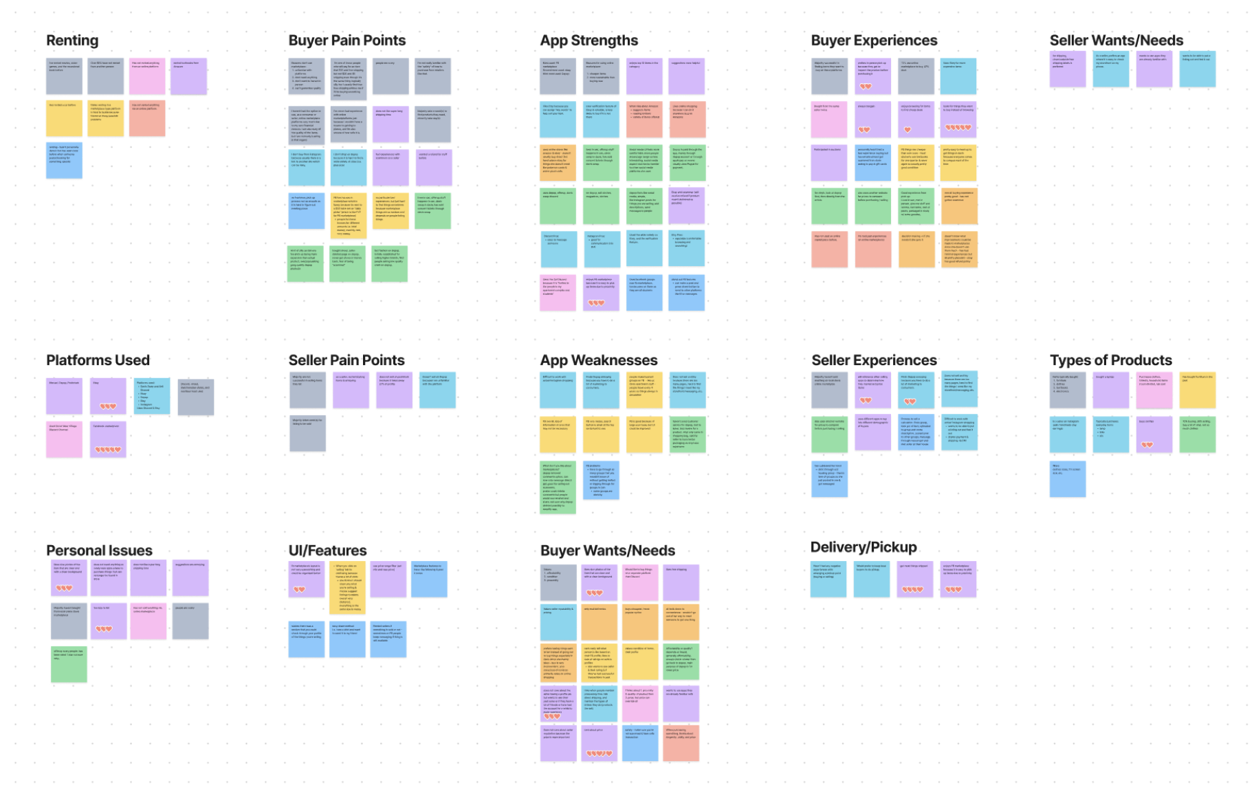
USER RESEARCH: AFFINITY MAPPING
Finding Commonalities
We consolidated our user research insights from our survey, interviews, focus group, and competitive analyses by placing all of our insights onto post-it notes and grouping them by common themes we noticed. We constantly refered back to this affinity map throughout the design process to quickly see at a glance all of our user research findings.
USER RESEARCH: USER PERSONAS
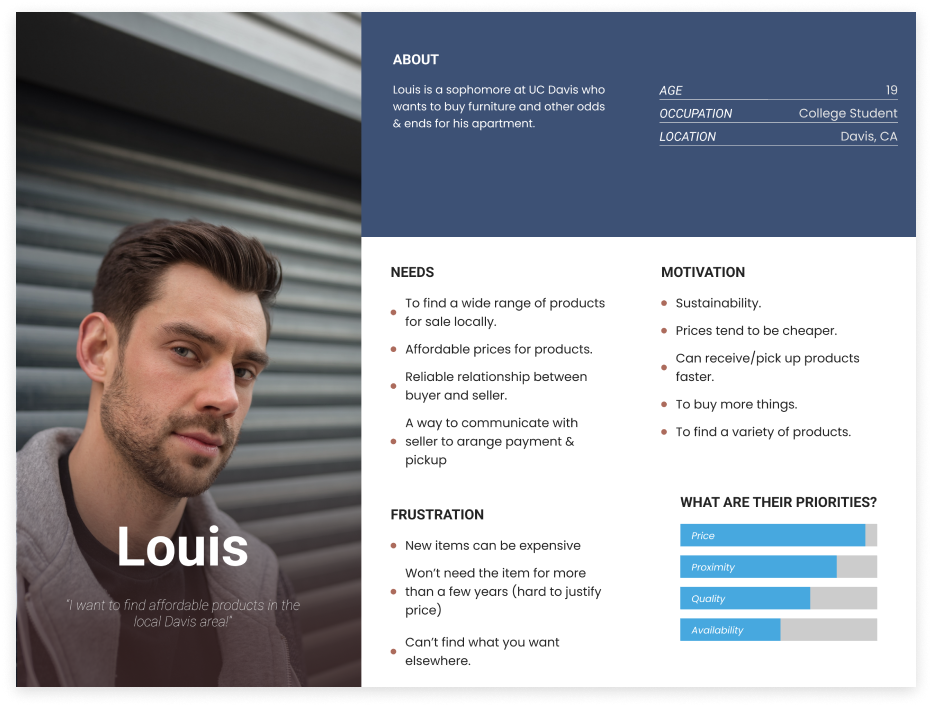
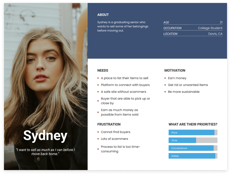
Meet Our Users
After finding common patterns from our user research, we created two user personas, one to represent the buyer and another to represent the seller, to show their goals, frustrations, and motivations. These user personas serve as a reminder to us throughout this project who we are selling for and the main pain points we want to resolve.
USER RESEARCH: USER JOURNEY MAP
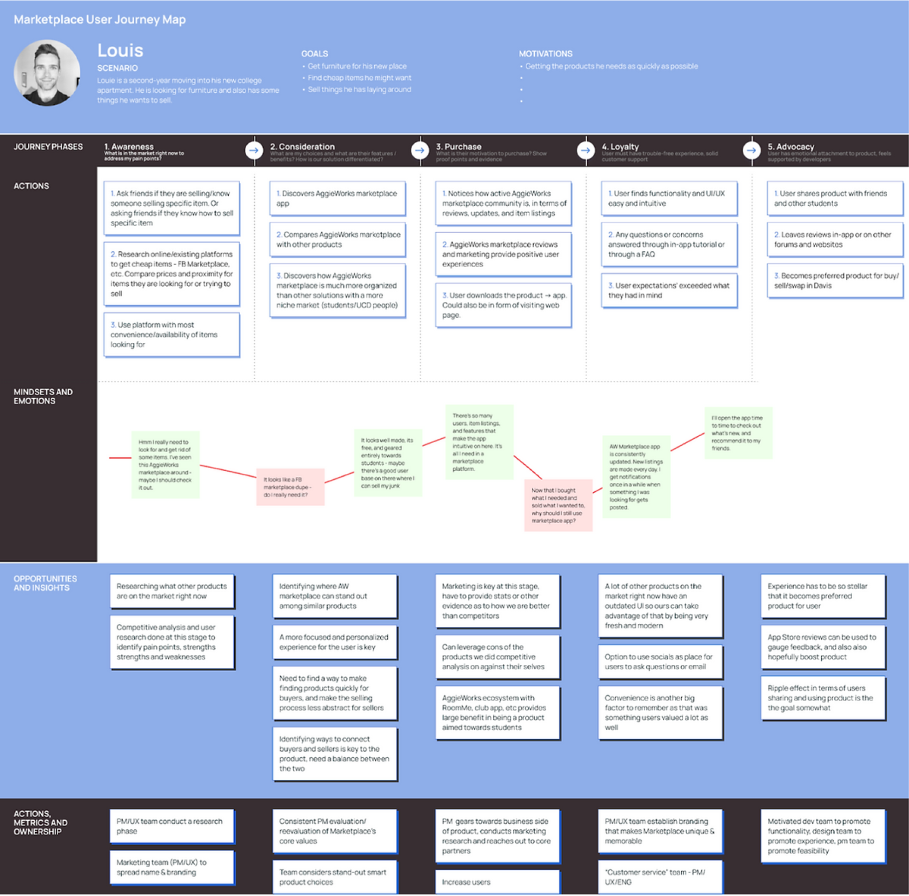
The Aggie Shopping and Buying Experience
We also created a user journey map for buyers to visualize the journey a typical student may take while using a marketplace app or website. Through this process, we found many potential user pain points, better empathized with our users, and found opportunities for improvement.
UNDERSTANDING: PROBLEM STATEMENT
How might we improve UC Davis students' online marketplace experience by promoting safety, improved item discovery, and quicker item sales?
UC Davis students face challenges while using online marketplaces: finding reliable local sellers, efficient item searches, trust concerns with unknown parties, confirming the condition of items, and finding affordable items.
IDEATION: FEATURES
Technical Constraint
As a student-run product team, we have limited funding and lack resources, so throughout this project our main challenge as designers were finding solutions to our technical constraints. For example, after discussing with our team, we discovered that incorporating payment and direct messaging on our website would require a significant time investment, pose implementation challenges, and potentially introduce reliability issues. Consequently, we decided to eliminate payment transactions and in-website messaging from our MVP. As a vital part of the marketplace experience, working around this constraint became our biggest challenge.
Our solution for communication between the seller and buyer is to allow buyers to message sellers through our website, which would send a message to the seller via email. Subsequent interactions and communications will continue to take place through email. For payment, it would up to the users to decide how they want to pay. In evaluating our user flow, we conducted a comparative analysis with established marketplace platforms like Craigslist, which shares a similar user flow, and Facebook Marketplace, which employs a comparable payment method. Our assessment indicated that our user flow is comparable with other popular marketplace platforms, and instead we can focus on enhancing the user experience in alternative areas.
IDEATION: FEATURES
Picking Our MVP Features
Next, we began to ideate solutions for our key pain points. However, given our tight deadline and lack of developers, we had to narrow down the list of features we would be implementing in the first iteration. To do this, with the help of our product managers, we rated the impact and effort of each feature on a scale of 1-3 (1 being high and 3 being low). We prioritized features that had high impact and low effort and made those a part of our MVP, or minimum viable product. Here is a snippet of our features ranking table.
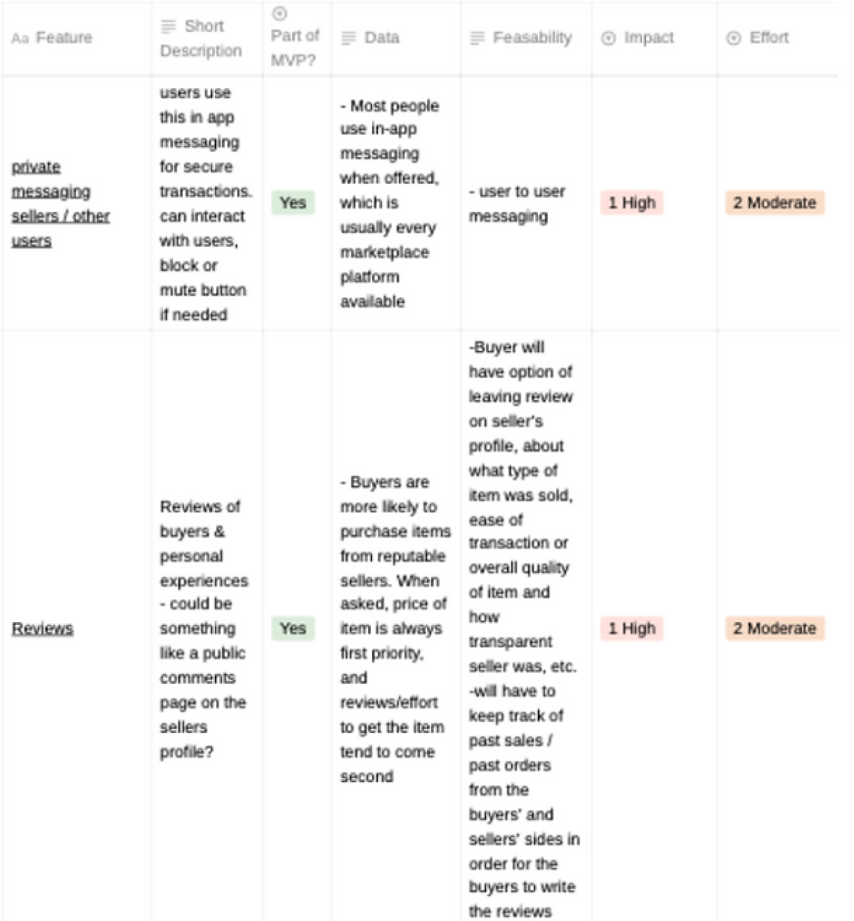
MVP Features List
Ultimately, we decided to design and develop the following pages and features:
- Home Page
- Profile creation
- Reviews
- Contacting seller
- Search bar and filters to find items
- Like and save items
- Buyer and seller ratings
- Item Listings
- Email notifications
- Student authentication
IDEATION: USER FLOWS
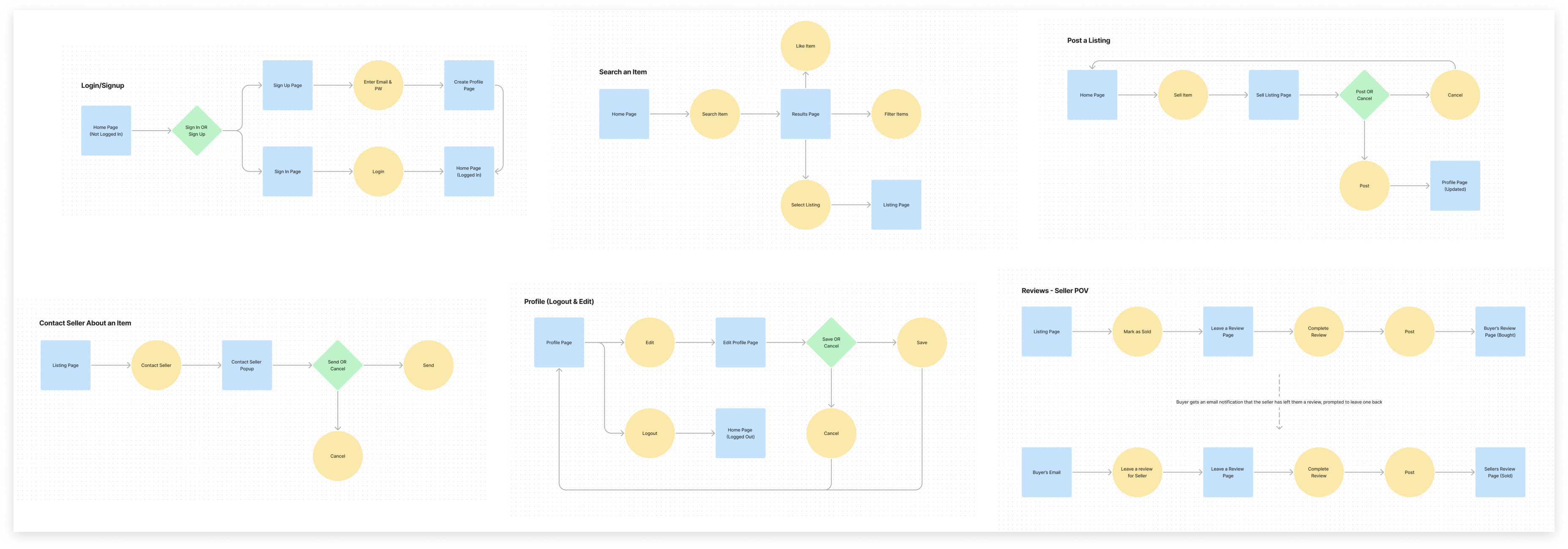
User Flows
We developed distinct user flows for various tasks as visual aids to better understand and illustrate the user's journey.
DESIGN: MID-FIDELITY PROTOTYPING
Creating the Skeleton
We created a mid-fi prototype with two flows to represent the seller flow and buyer flow. At this stage, we wanted the focus to be on the flow of the website rather than the appearance. Here are some of the wireframes for one user's journey through the site.
USABILITY TESTING
Putting Our Designs To The Test- 10 Usability Tests
We conducted 10 usability tests with UC Davis students and had them complete various tasks with our prototype. Our primary objectives were to evaluate users' ability to navigate the website effectively and gather feedback regarding their initial impressions. This initial round of testing played a pivotal role in providing valuable insights that guided us in making necessary adjustments to our initial user flow.
Parts of our prototype were intuitive
- Sign up/onboarding process was smooth
- Listing an item to sell and editing the listing was straightforward
- Uniformity in layouts of our pages (i.e home page, categories pages, all listings, etc.) made it easy for the user to understand how they function
- Searching for an item was simple
- Contacting a seller to purchase and item was a frictionless process for our testers
Other areas had room for improvement
01
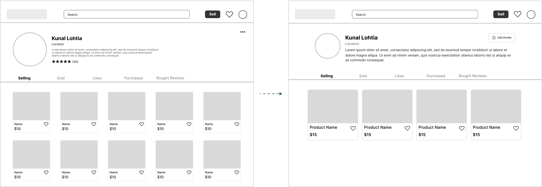
Profile Page Too Cluttered
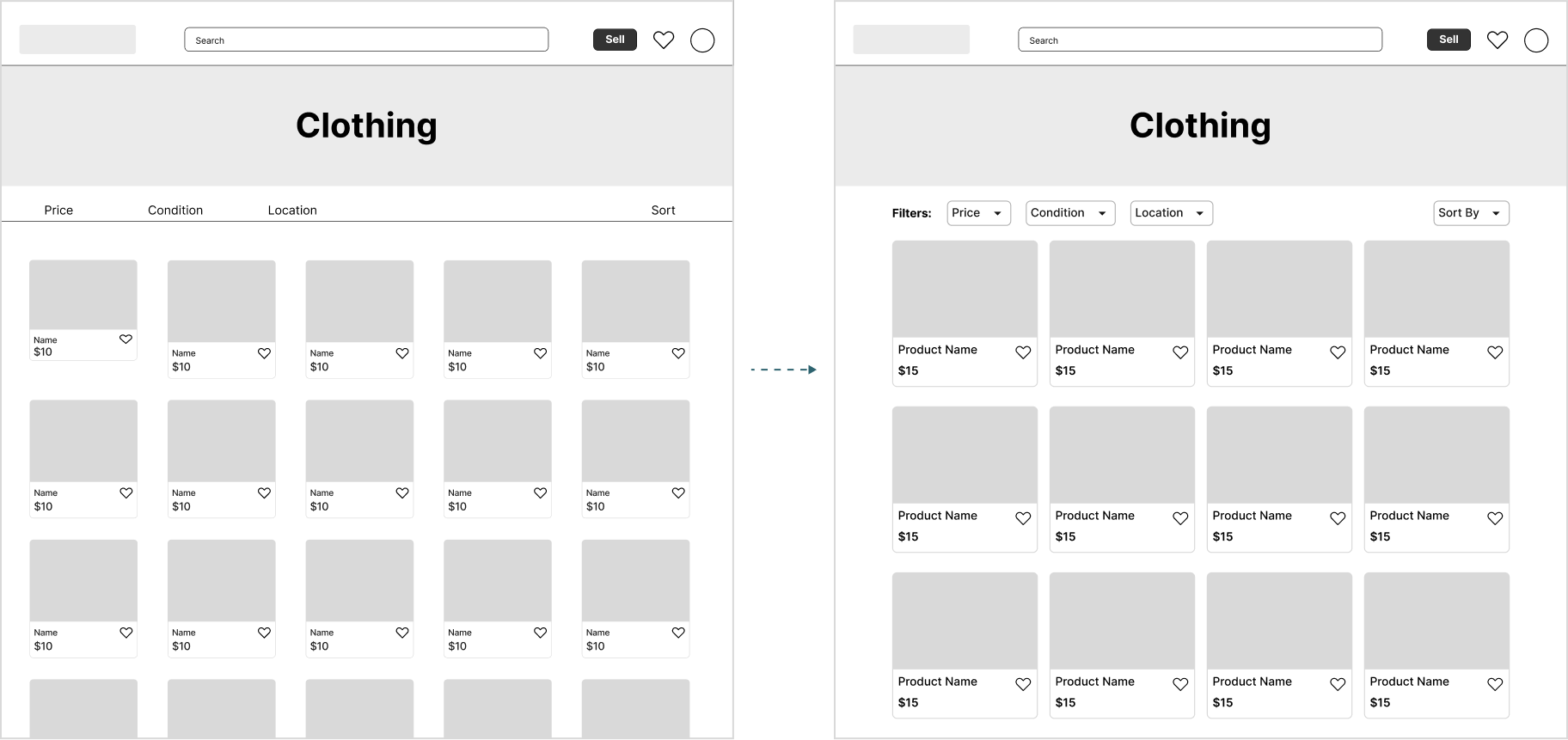
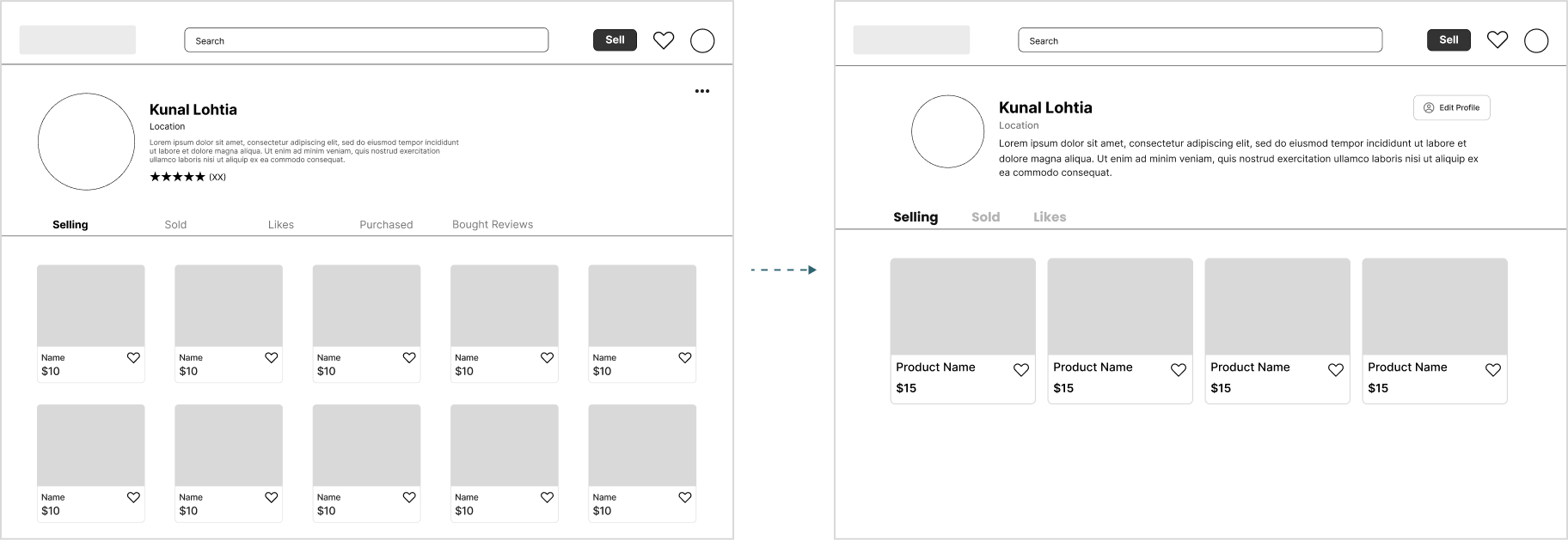
Users voiced concerns about the profile page, particularly regarding the overwhelming nature of the tabs and the small text sizes that span across the page. Additionally, there's ambiguity about whether the emphasis should be on the user's bio and name or their listed products. We decided to slightly shrink the bio section by decreasing the size of the profile picture and increased readability by shrinking the width and increasing the font size. We also increased the size of the listing card components to bring more attention to each individual listing.
02
Filters
The filter and sort by buttons were not obvious and users had a hard time accessing them. We fixed this by making it more like a button by adding a border and an arrow to indicate that it is a drop down.
03
Reviews
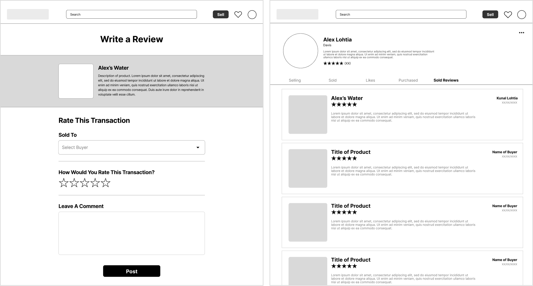
From our research, we learned that buyers highly valued purchasing from a reputable seller so we wanted to prioritize building a review system. In our effort to establish fairness, we instituted a system allowing both buyers and sellers to review their transactions. Each user's review section would contain a "Bought" tab, displaying reviews left for them by sellers they've interacted with, and a "Sold" tab, showcasing reviews left by buyers of their products.
Testers found the review process confusing because it involved opening an email to access the buyer's review page, which was omitted from the flow, hindering user comprehension; future tests will include mockups for complete clarity. Furthermore, it became evident that users were uncertain whether their reviews pertained to the transaction partner or the product, necessitating clarity in the review page's purpose and wording.
Owing to the complexities of integrating notifications within our website, our Technical PM and developers suggested we send emails to buyers once a transaction was finalized, prompting them to review the seller. However, it was later noted that this approach introduced an extra step that discouraged buyers from submitting seller reviews. Ultimately, our PMs decided to cut reviews from our minimum viable product as we did not have the time or resources to fully fix the system. We decided to save our work on the review flow for a later iteration.
04
Purchased Tab
Following the completion of a transaction, sellers originally had the option to mark a product as sold and designate the buyer. This information would then be displayed on the buyer's profile page under the "Purchased" tab. However, when considering our competitive analysis, where we observed that many Facebook Marketplace listings remained active even after being sold, we were concerned that a similar lack of motivation and an additional step might lead sellers to skip this part of the process. We decided to eliminating the "Purchased" tab as the displayed items under "Purchased" would be inaccurate if the seller chose not to mark them as sold.
DESIGN: BRANDING
Branding
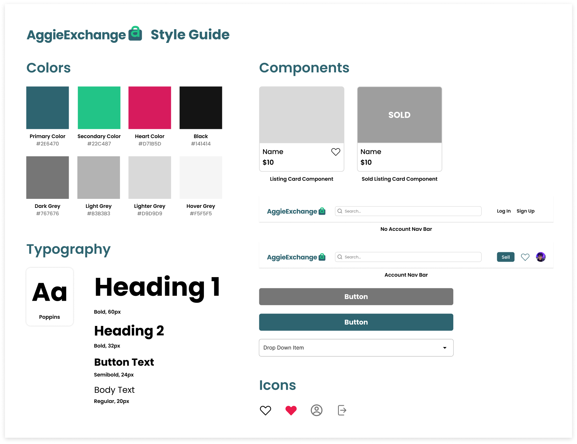
The core values of AggieExchange are safety, local, sustainable, community, and budget-friendly. Thus, we spent a lot of time making sure our color palette, typography, and logo aligned with our values.
Colors
We applied principles of color psychology to guide our choices concerning the website's color palette. Given that budget-conscious shoppers have demonstrated a favorable response to teal according to research such as summarized in this article, we opted for it as our primary color. We complemented the teal with a vibrant green, a welcoming, joyful, and environmentally-conscious color that aligns with the values of our product. The complimentary touches of pink, aqua, orange, and purple amplifies the playful essence of our brand throughout the site.
Making sure our website complies with the Web Content Accessibility Guidelines (WCAG) was a high priority of ours as we wanted our platform to be accessible for all students. Thus, a lot of time was spent testing different shades teal to ensure that all our our components complied with WCAG while still remaining visually interesting and welcoming.
We selected Poppins as our font, as we wanted a clean, modern look throughout the site. This typeface also aligns with our university's branding, leading us to believe that a similar font choice would evoke a sense of familiarity and resonance.
Logo
For our logo, we sketched our dozens of ideas and went through multiple rounds of iterations until we landed on the final design. Our final logo mimics a shopping bag by using the top of the lower-case “a” as the handle. Peers also shared that our logo resembled a lock, which aligns with one of the main values of our platform, security. The rounded corners also give off a more soft, welcoming feel to our site.
Graphics
Since there were limitations to the features and pages we could design due to technical constraints, we spent more time on the visuals of our site to make AggieExchange more fun and welcoming because according to our user research, a clean, beautiful UI plays a big factor in whether they will use a marketplace platform. Though we both partook in every part of the design process, I focused more on hi-fi prototyping and making sure all our prototypes were clean, functional, and accessible, while my fellow product designer focused more on branding and graphic design. She designed dedicated banners for the Home Page and each category page to help our platform stand out by being more visually engaging.
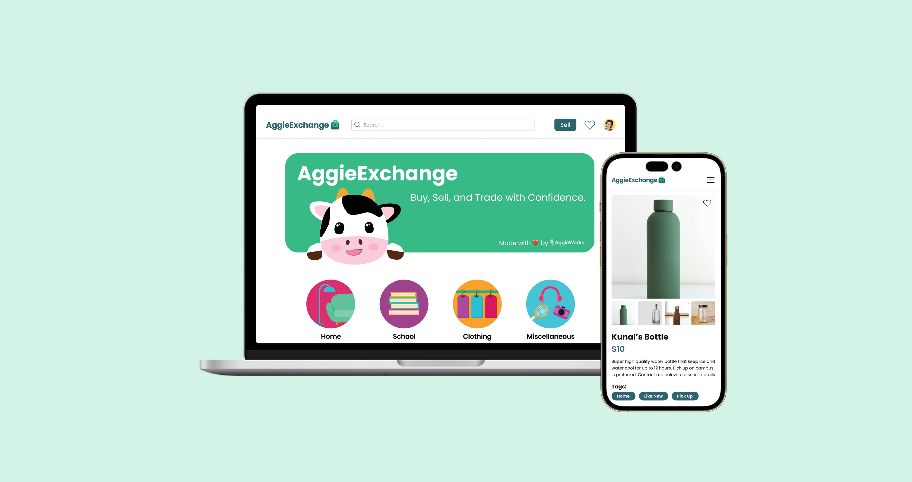
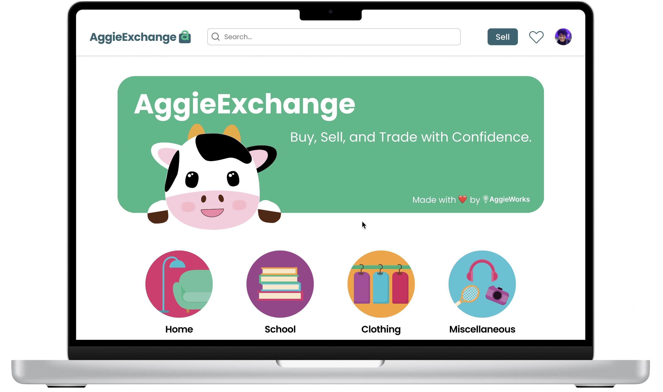
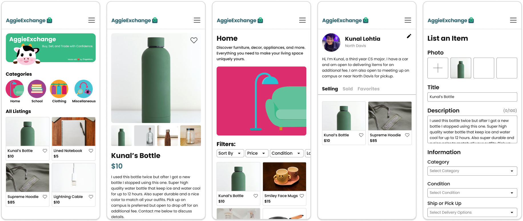
HI-FI PROTOTYPE
Enhancing the UC Davis Marketplace Experience
Helping students connect to sell and buy in a safe environment with improved item discovery and quicker item sales.
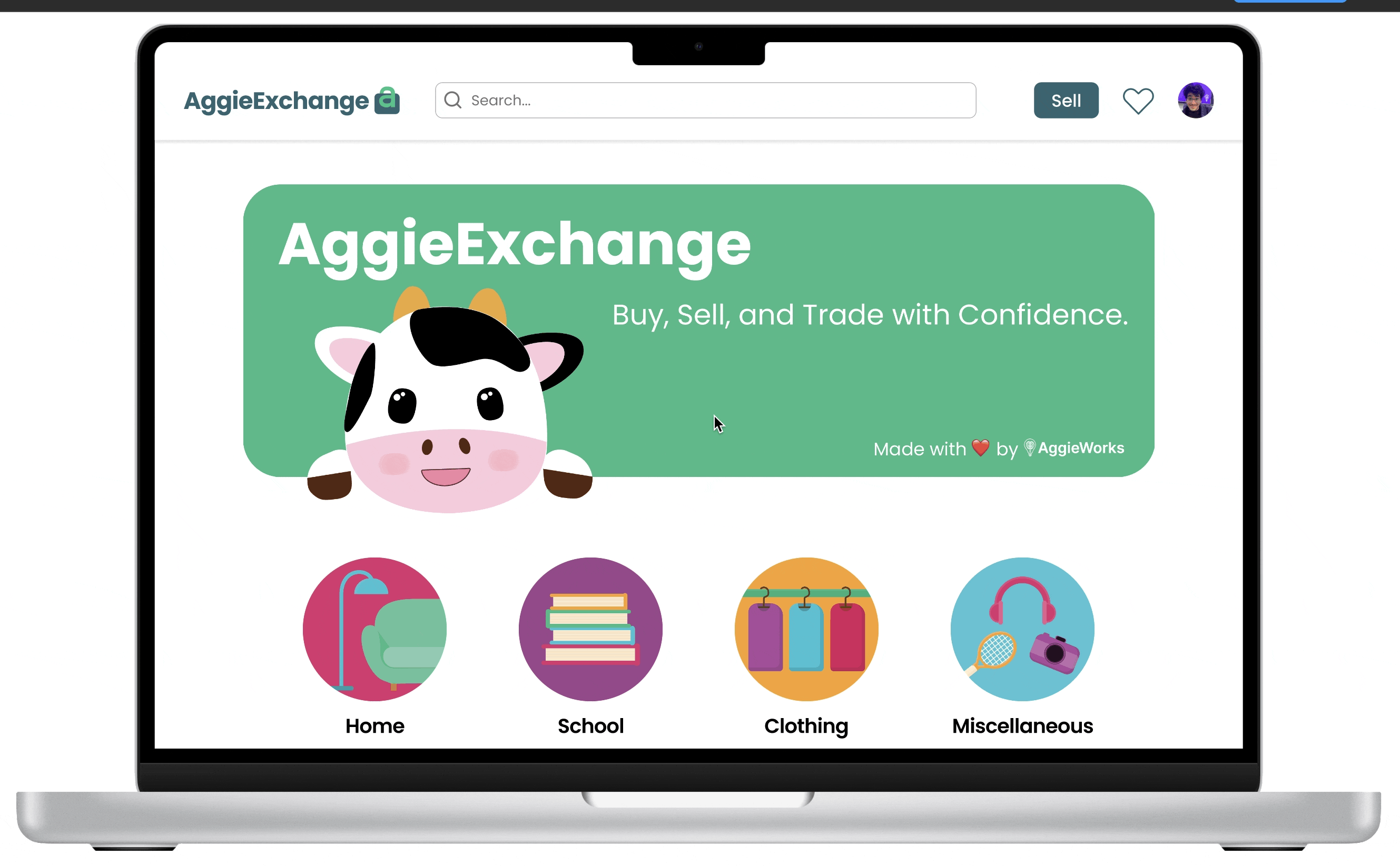
Sign In & Sign Up
When users open the AggieExchange website, they will arrive at the Home page, where they can search and view listings. For further action such as liking, selling, or buying, they must sign in or create an account using this UC Davis email. To create an account, students will be prompted to provide basic information, including their name, location, and a short biography.
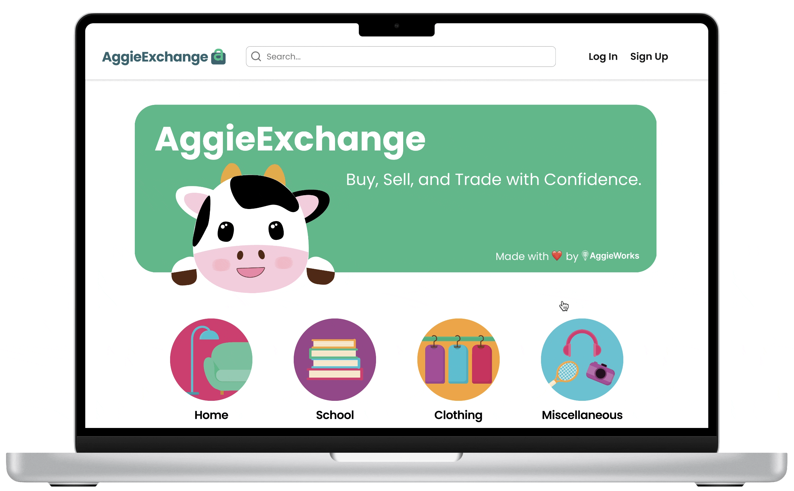
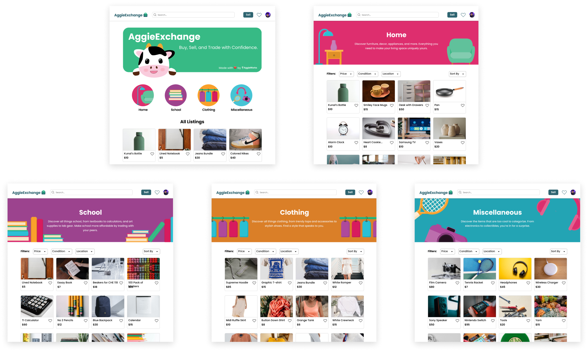
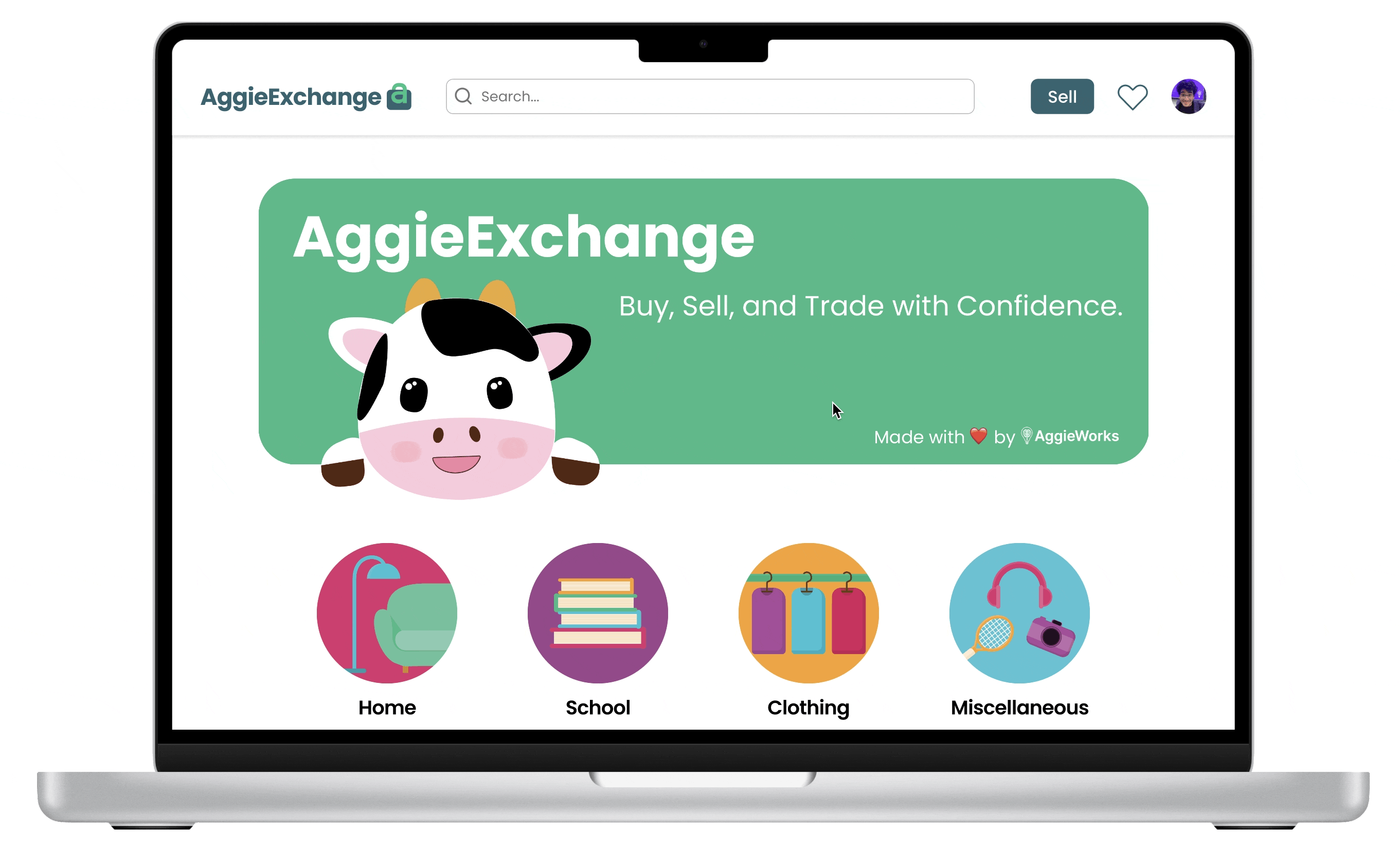
Home & Category Pages
Upon entering the site, users are welcomed by the AggieExchange mascot featured on a banner. Following that, they have the option to explore the four categories: home, school, clothing, and miscellaneous, or view all listings.
Create A Listing
To begin selling, students can create a listing, which will ask them to fill in basic information such as name, condition, and price. Furthermore, users have the flexibility to select from a variety of pickup options and tags, enhancing their chances of making successful sales.
Profile
The profile page functions as a storefront for students, enabling them to effortlessly manage their listings. Additionally, users can access their sold items and liked items and make profile edits.
Live Website
To view live website, please visit AggieExchange.com.
DEVELOPMENT
Developer Handoff
Once we had completed our final prototype, we handed off the designs to our developers. Some changes were made to improve the responsiveness of our designs as we wanted our website to be enjoyable on mobile devices as well. Here are some of our mobile website wireframes.
We are currently in the development phase getting ready to release our beta launch at the beginning of Fall 2023 when students are moving in to new apartments and dorms and ready to sell and purchase items.
CONCLUSION
Takeaways
This project was unlike anything I had done before as I was in charge of a product from coming up with the prompt to research to design to branding to testing to the development handover to marketing. It exposed me to many realistic issues that I never had to consider for other personal projects. Through this process I gained so much valuable experience such as advocating for my designs, designing for the product lifecycle, working in a cross-functional team, branding to be accessible and reflect our values, and much more.
Thinking back on improvements I could’ve made, I think we should have conducted more usability tests on the hi-fidelity prototype, particularly focusing on UI-related concerns that emerged in our initial rounds. In addition, we should have designed with responsiveness in mind so our website would be user-friendly across all interfaces. Additionally, a more extensive ideation phase, including the exploration of backup options to reinforce our core values, would have been preferable but was challenging due to our accelerated timeline.
CONCLUSION
Challenges
Technical Constraints: The biggest challenge was working within technical constraints, which limited the freedom we had and the amount of features we could explore. However, this was great practice as it mimics what would happen in the real world and it pushed us to think more creatively about technically-feasible solutions.
Product Timeline: Another challenge that we as a team had to overcome was meeting product timelines. As the peak selling and buying windows are the few weeks before and after the beginning of school, we were on a strict timeline to conduct research, design, develop, test, and market, within a short-time period. This resulted in us pushing back the release of certain features and making compromises to some steps of the process.
Defending Design Decisions: Due to time constraints, our PMs often suggested reducing time for ideation, prototyping, and testing. In addition, members of our organization come from a predominantly computer science background, thus we were required to constantly educate others about the important of good design practices. Through frequent stand-ups and design critiques, we learned to explain and defend our design decisions with research or testing results, which are valuable industry skills.
CONCLUSION
Next Steps
The journey continues as we're actively working on Iteration 2 of our product, which will introduce features such as reviews and a feedback page. However, as of June 2023, I've graduated and won't be able to attend in-person meetings, thus I've stepped down from my role as a product designer. Nevertheless, I'm genuinely excited about witnessing the implementation of our new designs and seeing our website evolve, enhancing the apartment purging and treasure hunting experience for UC Davis students.